A huge thank you to those businesses who sponsored different aspects of this home office project — Infiniti Shades, Davida C. Interiors and The Organized Mama! As always, all opinions are my own.
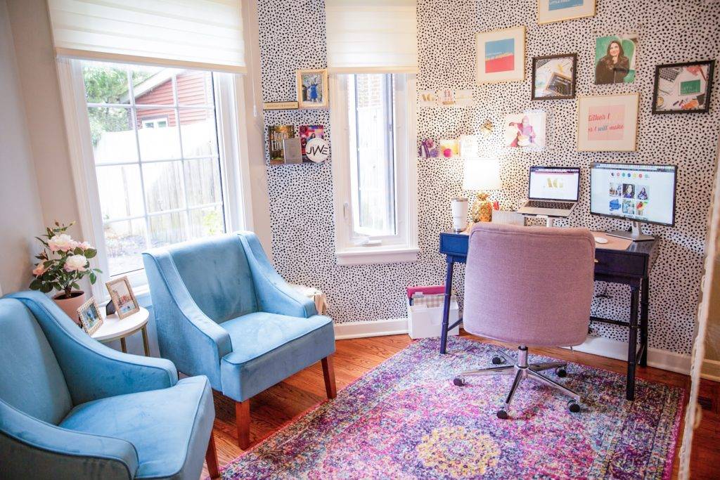
As you know, the last year has been full of changes, especially professionally. The layout of our smaller, city house didn’t leave much space for me to have my own office or place to work, but it became necessary when I started AG Creative Consulting and A Glass of Goldwater full time. I began to rack my brain and Pinterest for any ideas for *small* office spaces and living room office spaces. Basically, we were going to have to turn our dining room and some dead space into a dining room and my office. It wasn’t going to be easy either.
If you just want to shop my home office, check out that post here. Otherwise, I’ve linked all products at the end of this post as well!
This was going to have to be done on a budget…
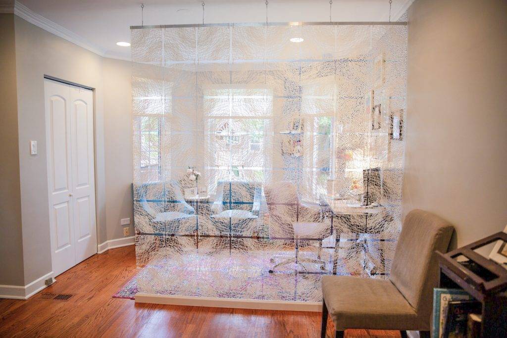
So I did a TON of research. It was very important that I have a physical divider between my office and the rest of the space. This was partially because I wanted it, but mostly because my kids need a physical reminder. Even though Mommy is home, when I’m in my office, I’m unavailable to them. I had been working in the middle of my living room until we did this space, and it just wasn’t working for anyone.
So as much fun as an entire re-do would be, it wasn’t in the budget, so I called in Davida Atkin from Davida C Interiors to help figure out what we could do with the space that would make sense, both physically and budget-wise. Davida is unlike any interior designer I’ve ever met. She literally told me to stop buying things, because we could simply re-arrange our current dining room furniture to save money. Yes, an interior designer told me to a) stop buying and b) that she wanted to save me money.
Davida ended up recommending that we swap the two “spaces” in the dining room. We moved the dining area to the front of the house, and moved my office to the back. It was as easy as having an electrician come and pull the electric for the chandelier and moving our china cabinet to the opposite wall.
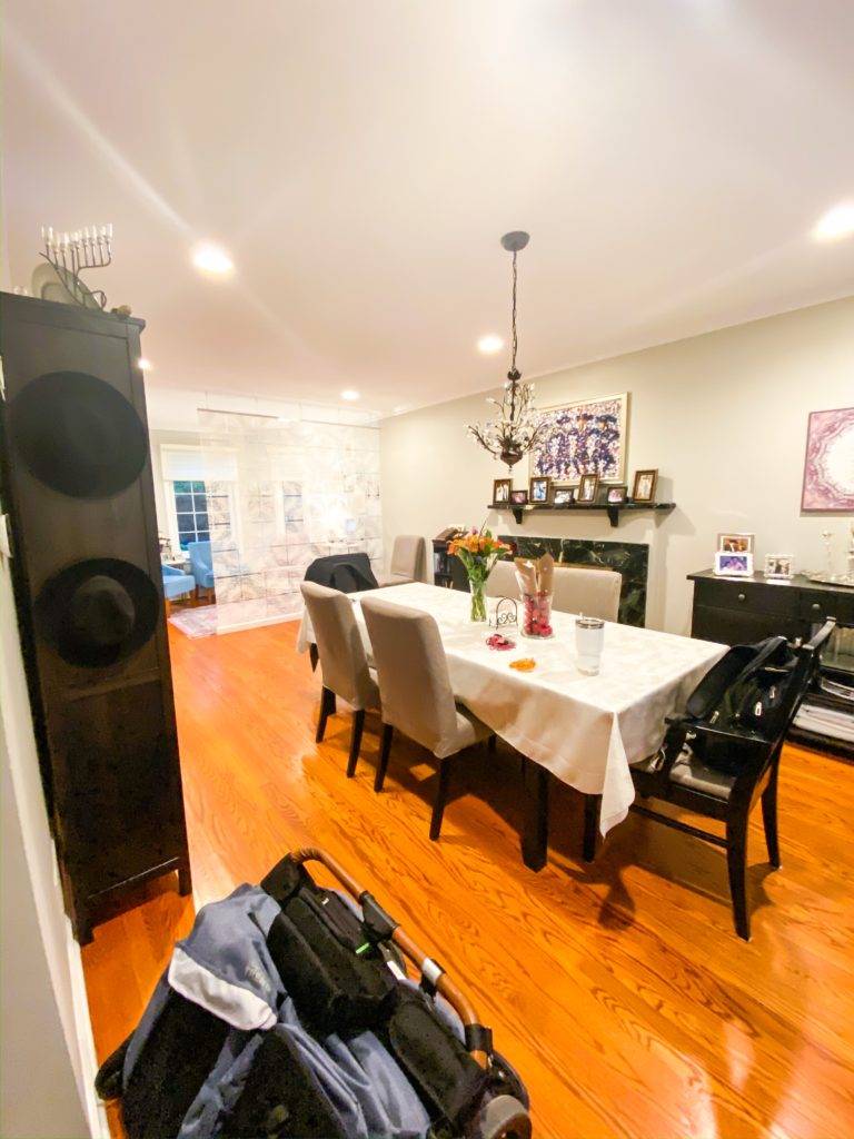
The chandelier and table used to be right where the wall to my offie is now, and the tall china cabinet was on the opposite wall, where my desk current is. The room felt very heavy and dark. This simple and cost-effective move made ALL the difference.
Office details:
So now to the really fun part, where I get to share everything I chose for my office with you! Davida helped mostly with the layout, and I bounced ideas back and forth with her and my friend Jessica from Organized Mamas, but I’m really proud that all of the major decisions were made by me!
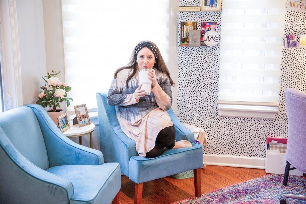
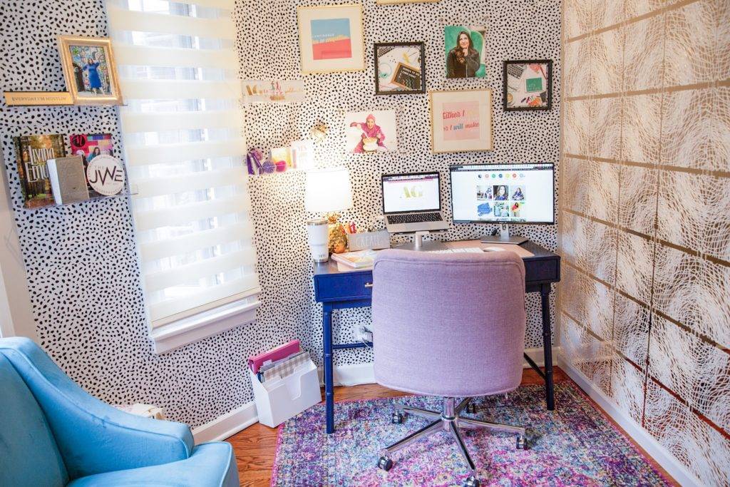
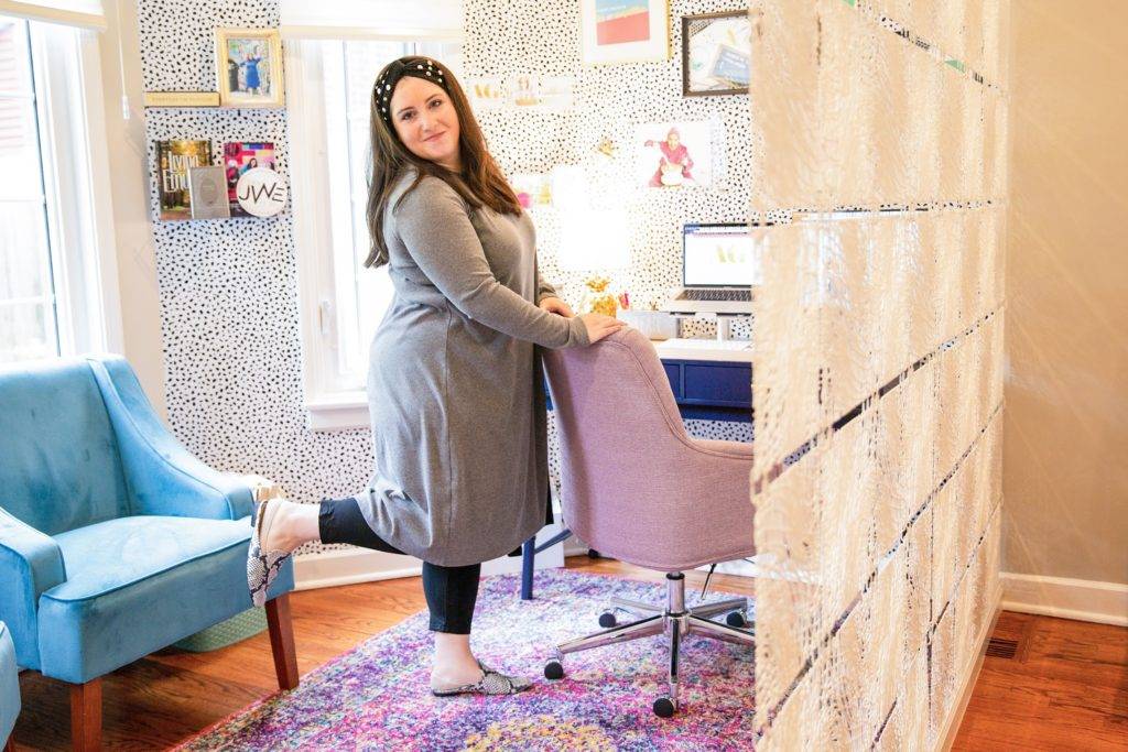
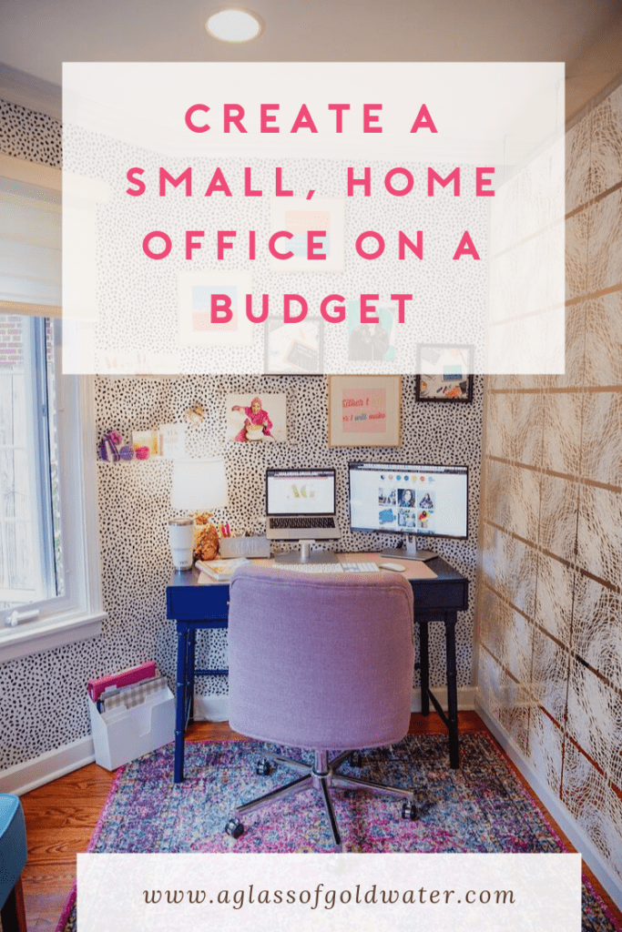
My most creative and best decision was the beautiful, acrylic, hanging wall divider that I purchased from Amazon. Some people even told me that it would be weird, but I just had a feeling, and WOW! What a statement. It’s an art installment that serves a purpose. The light shines through it so that the room is still open and flowing. I couldn’t be happier with this piece. The best part is that it was super affordable, and I just had a handy man install it.
It was important that the space feel creative, inspiring, organized and modern. With my color choices, wall paper and gallery wall, I think I accomplished all of this.
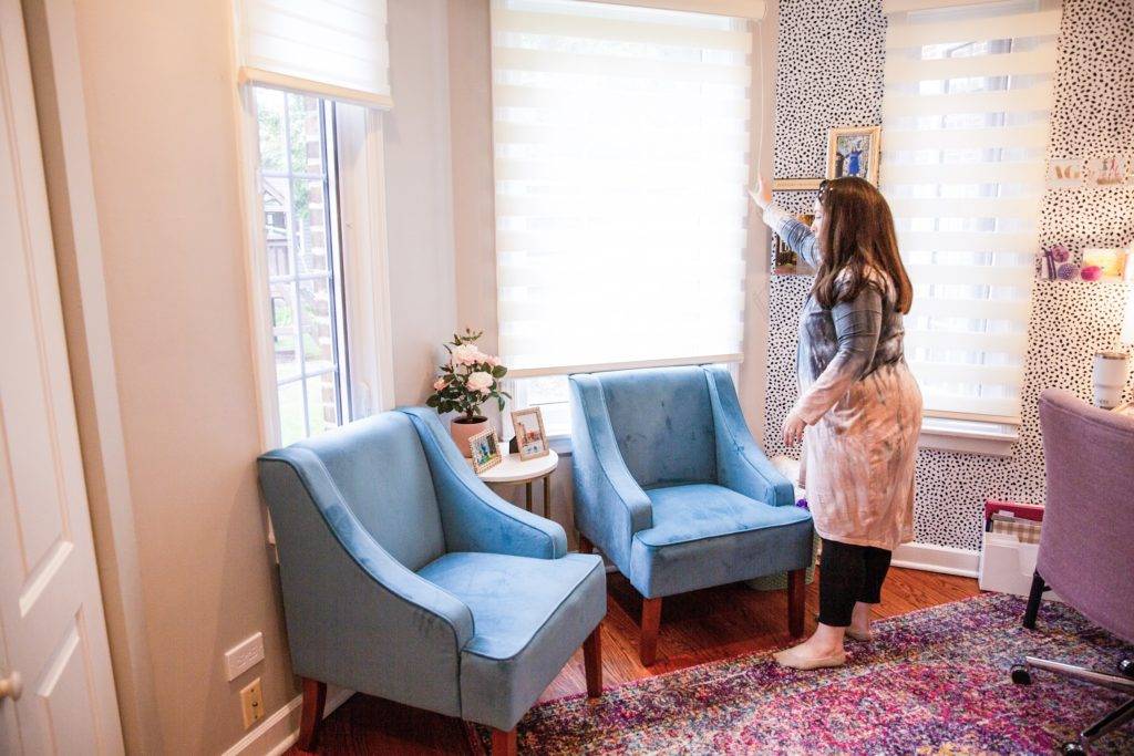
Window treatments can totally transform a space. With the help of Infiniti Shades, we chose a beautiful blind that would only enhance the space. They are both functional and fabulous, and Effie was wonderful to work with. I know if we ever have a problem in the future, Infinti Shades will have us covered. A huge thank you to them for the discount on the shades for our entire first floor. The house is so much more light, modern and airy now. Not to mention, the innovative retractable-cord blinds that they offer to make it safe for our kids.
The Gallery Wall:
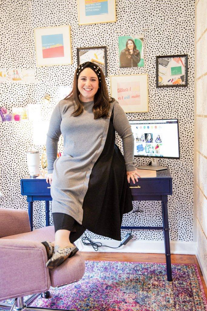
Finally, I want to talk about the gallery wall. I’ve never been sure about how to do it, and after this project, I truly feel that there is really no “right way” to do one. I knew I wanted to be inspired every time I look up. So I chose some of my favorite pictures of myself and some quotes that would make me want to hustle when I read them. As for placement? I tried not to stress about it too much. I just sort of went with the flow and placed things as I felt appropriate. There is a bit of empty space where I think I’ll add one of two more pieces, but other than that, it’s exactly what I imagined. And the wall paper is just incredible. It’s easy! Peel and stick from Target. We needed a roll and a half to cover the space.
I know you might be thinking that it’s annoying that I didn’t give specific rules about creating your own gallery wall. But I think that’s just the point. Don’t stress too much, and it will flow the way it’s supposed to. I’m trying to channel that mantra into my own life as well, this coming year.
Thank you ALL for being on this journey with me. It’s been a wild year, and now with this beautiful space to call home, AG Creative Consulting and A Glass of Goldwater only have incredible things coming in the future.
I hope this post leaves you inspired to create your own space, even if it totally seems too far out of reach, not affordable or your space is “un-workable”, I promise you can do it, if you let creativity take its course.





Leave a Reply