Here we are at the final installment of my “How I Blog” series. If you’ve missed them, check out Part 1 and Part 2!

so let’s jump in!
The first 9 photos on your Instagram feed are going to be the deciding factor between “follow” and “unfollow”, so you have to make them count! It’s important to develop a cohesive “look” that spans across your photos. And you’re not going to get the look you want on the first try, or first 20 tries for that matter. I’ve tried all different edits on my photos. First was “light and bright”. Next was “muted and pink-tinted”. And for now, I’m loving the more muted colors, while still having a lot of clarity and richness to the pictures.
If you look at my feed, you can see that a lot of the same colors keep popping up. This also helps keep everything looking cohesive.
Sometimes it can be hard to attain one look, especially when you’re working with different photographers who don’t let you edit their photos. I have two different photographers, aside from myself, that are featured in photos in the above feed screenshot. While you might be able to see the difference in the photo edits, I maintain a similar feel across all of my pictures. This is one of the most important factors to keep in mind when you want to make your Instagram appear professional.
so let’s talk about photo editing.
No Instagram feed is ever going to be 100% perfect. But in order to create a look that you’re happy with, you’re going to have to edit your photos in some capacity. I don’t mean, airbrushing to get rid of your monthly pimple, or tightening up the curves on your hips. The kind of edits I’m talking about focus on the light, color and clarity of your photos.
To give you a bit of insight into how I edit, I’m going to take you step-by-step with one of my photos. Now to be honest, the picture I’m using had good lighting and didn’t require so many edits, but it will work well for these purposes.
Before we start, many Instagrammers and bloggers use something to edit their photos, called presets. A preset is a series of edits that have been created by them or someone else that is applied to each photo at the beginning of the editing process. By using the preset it gives the editor a bit of a head start to achieving the look they are going for. I use presets from both the Light and Airy Photog and Jana Bishop.
So now let’s go step-by-step through my editing process:
Upload the original photo(s) into Adobe Lightroom CC (mobile). I ONLY edit my photos on mobile.
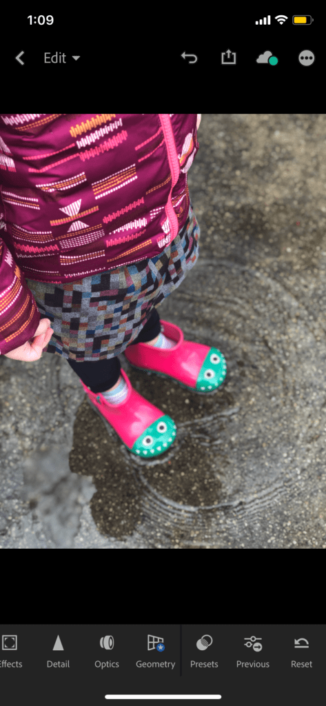
Next I add the preset, and then go to the light tab to adjust the exposure. In this case, I took it down a bit.

Then I go to the color tab and adjust the saturation. For my feed’s look, I decided to take the saturation down a bit because the colors were very bright to begin with. Depending on lighting and colors, sometimes I may take the saturation up a bit.
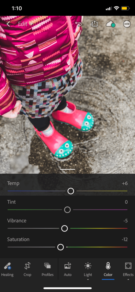
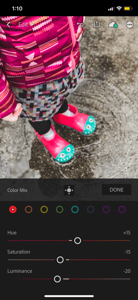
Then, you’ll notice how there is a lot of red and red hues in this photo. They’re also very dominant and bright. So I went to the mix tab in the color section, and took the saturation down, specifically in the red color.
And then I wanted the photo to appear extra crisp, so I took up the clarity just a bit.

This was a quick edit, but if I did it again, I probably would’ve taken the saturation down a bit more. It’s still a bit brighter than I normally like. I just wanted to give you a little insight into my editing process with each photo.
finally, I want to give a little back to you.
I put together a resource guide of the influencer/brand networks and Facebook groups that I have found most valuable when applying to and being accepted to sponsored campaigns.

[wpforms id=”1498″ title=”false” description=”false”]
Like this post? Pin it!




Leave a Reply